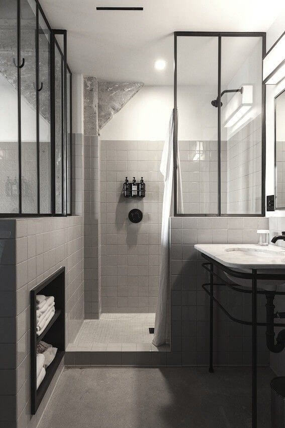
1. Subtle But Contrasting Colours
The beauty of this bathroom is in its colour scheme. Overall, the grey gives it a subdued effect, compared to the pristine white of many bathrooms, but still benefits from the contrasting black on the glass frames and the sink. This allows the bathroom to be a little dirty on occasion, and not too shocking on first glance, without losing the minimalist effect that many modern bathrooms aim for.
2. Pure Square Design
This bathroom is the epitome of perfect angular design. The square tiles and soft cornered, shallow rectangles are a great way of emphasising the shape of the room, without wasting any space. Extra space is added thanks to the mirror on the bath tub and lack of pedestal on the sink.
3. Lonely Standalone Bath Tub
Not something you're likely to see in a "best small bathroom design" category, this hexagonal shower 'cubicle' and standalone bath are centre stage to an otherwise empty room. The effect is one of decadent minimalism that has the space available to specifically not use. The emptiness is emphasised by the light-coloured floor and ceiling compared to the black walls and bathtub - in other words, the space not being used is highlighted and contrasted against the solid, present elements.
4. Small Bathroom Design
This bathroom speaks for itself, as far as use of space is concerned. We've all lived in houses which don't allow room for a proper bathroom, but by opening up the shower and tiling the floor this bathroom is able to create some extra space, both visually and physically. The use of space is made even more efficient by using a back to wall toilet, ceiling mounted shower head and under-sink shelving. It doesn't get much better than this.
5. Homogenous Tiling Pattern
This bathroom is brought together by tiling the floor, walls and even bath panels in the same style. This enhances the use of space by both reducing the number of competing elements, and by using a larger tile size. The large tile size is a classic way to make a space look larger, and with less objects interfering in the picture - such as a separate bath panel or cistern, the eye is allowed to wander and invent its own space.
6. Hidden Storage Space
This is a really clever way of adding more storage space to your bathroom without being obvious about it, which is even better if you don't like showing off your toiletries. Hiding a drawer behind a panel, and using a robe hook or towel ring as the handle, will allow you to keep all of your bathroom items hidden away without using up any extra space.
7. Outdoor Bathroom Space
It's not for everyone, but some people like to make use of large, hidden gardens by having an outdoor shower. This concept takes it just a little further by moving the entire bathroom outside. High walls that, hopefully, only look out on the garden mean that this bathroom gets plenty of natural light and fresh air. Probably a better idea for warmer countries than the UK though!
8. Super Simple Contrast
Unlike the first bathroom, which used more subtle shades, this bathroom is designed to stand out. The effect is one that is incredibly sharp, backed up by the hexagonal tiles, with no meeting in the middle for black or white.
9. Inset Bath
Sometimes, creating more space isn't about how you use the space, but about how it looks like you use the space. Imagine this room if the bath were on the floor, rather than in it, and you can immediately see how much space it seems to save. The best part is that it actually takes up just as much space as a normal bath would!
10. Clean and Simple
This bathroom is smooth and simple. The marble finish means that it isn't too plain, but nor is it too busy, avoiding the contrast effect that other bathrooms frequently show off. The marble is designed to not look like tiles, so that the finish looks continuous. The hidden cistern for the toilet, just like the hidden pipes and lack of pedestal for the basin, finish off the smooth effect.
11. Eco Friendly
Although it's not actually pictured, this basin empties water into the shower area, which itself empties into a greywater system for use in the garden. There's much more to this bathroom, which you can read about in the Natural Home Bath of the Year article, but we definitely thought that the sink draining to shower area was an excellent touch.


